
Project Type
UX/UIMy Role
DesignerProject Overview
Primary goal
of the project
1. Improve the navigation system to provide visitors with a clear and simple way to find relevant content easily.
2. Update the visual design of the website to be more modern, cheerful, and trendy.
3. Redesign the logo to achieve a more contemporary look.
Original Logo
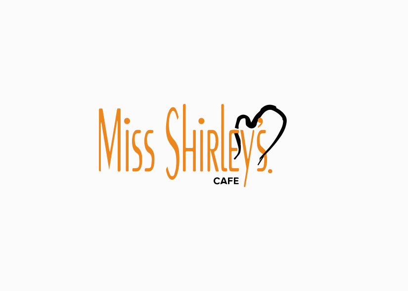
The original logo used orange as the primary color and featured a condensed typeface with a kitchen glove symbol, but the contrast between thick and thin strokes made it hard to use on different backgrounds.
Redesign
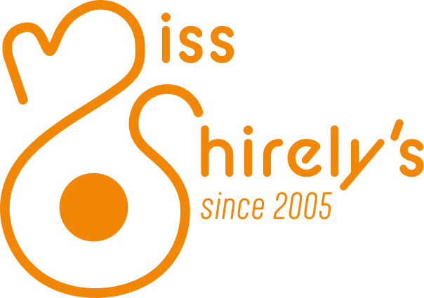


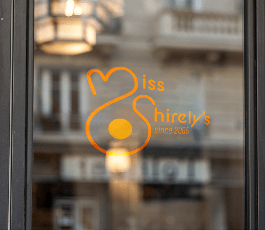
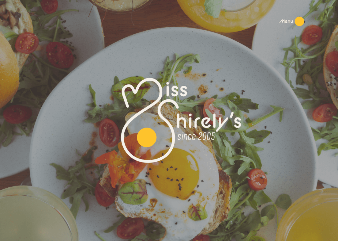
The new logo is a combination of the original kitchen glove, the restaurant's initials, and a fried egg, capturing the welcoming brunch café mood.
The simplicity of the new logo aligns perfectly with Miss Shirley's core values while ensuring familiarity for existing customers.

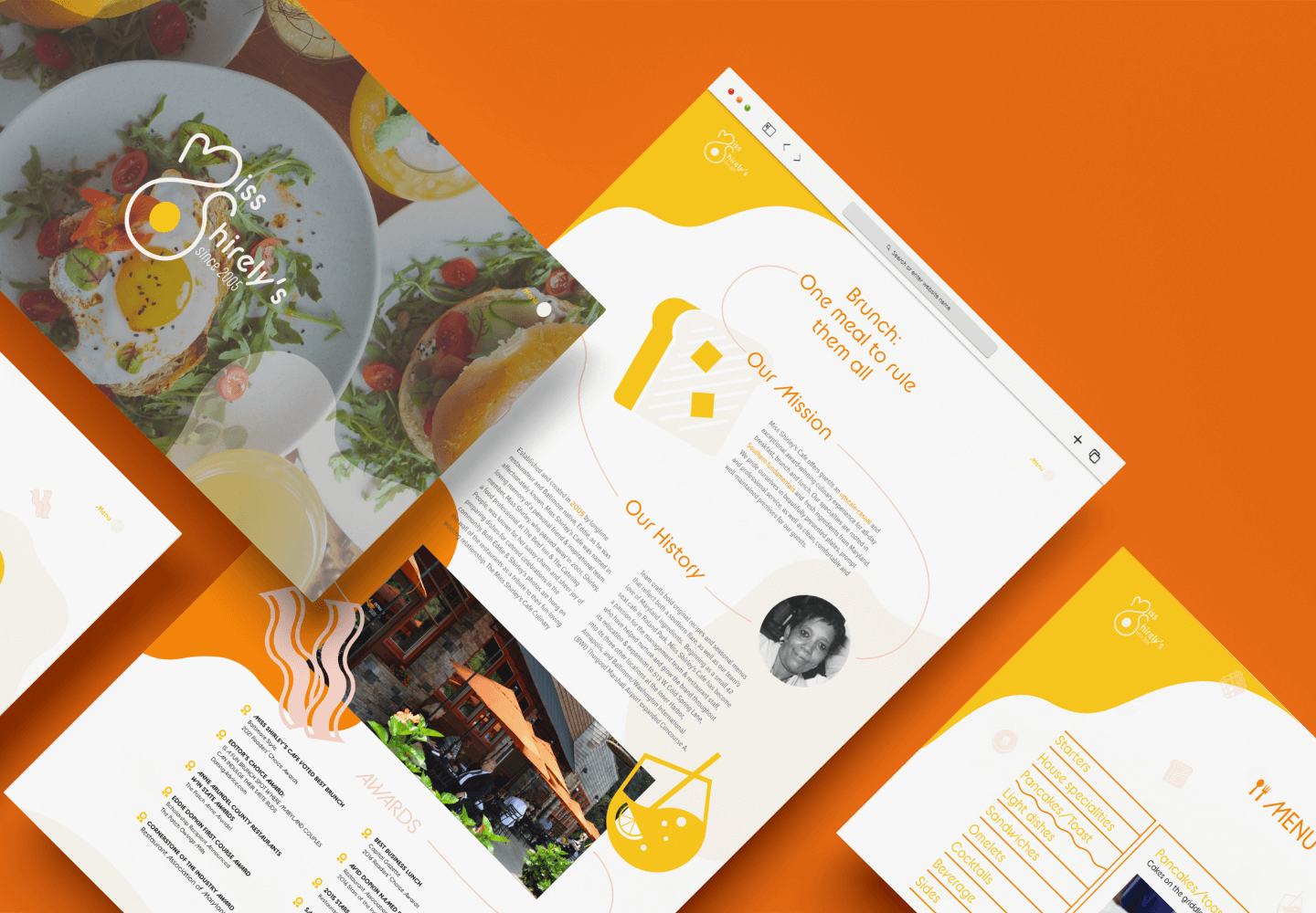
Website Redesign
To enhance the user experience, the number of menus on the website was reduced, and information was organized in a more structured manner to avoid overwhelming visitors. Throughout the website, a uniform look and layout were adopted, utilizing a concise color palette and icons to maintain visual consistency.
By implementing these changes, Miss Shirley's website will better reflect the warmth and charm of the brunch cafe, enticing more users to explore their offerings and experience the delightful ambiance of their restaurants.
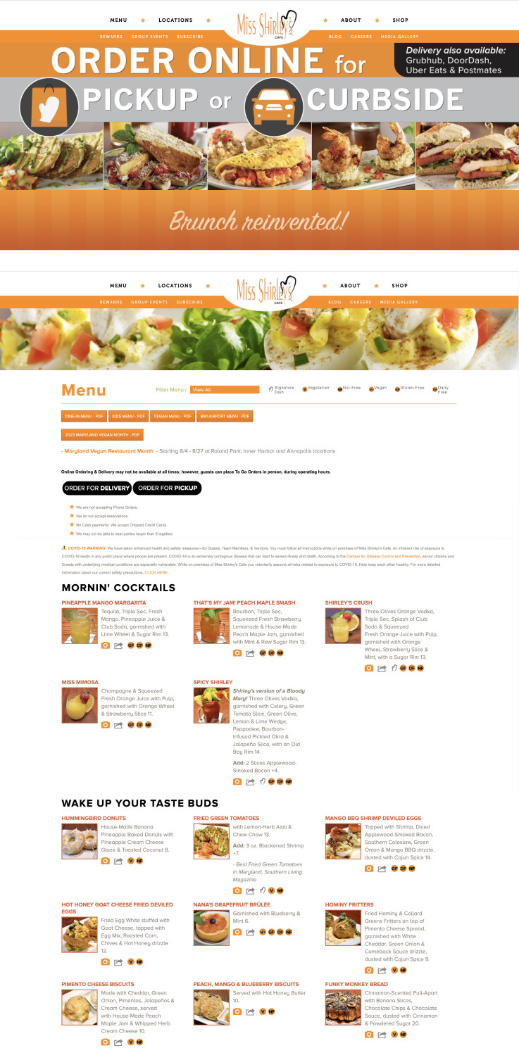
Original Website
Information
Architecture

Grid

Typography

Color

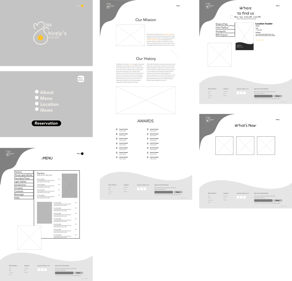
Wireframe
Ui kit

